
ggplot2及其扩展包绘图总结
像这样的教程应该有很多了,但为了自己查阅起来方便,我决定自己也写一个。这里我会尽量多的用到各种theme和palette,省得每次绘图还要一个一个试,看哪个好看(通过这个过程,我可能体验到了女生出门前挑衣服的感觉)。
先把需要用到的包载入:
library(tidyverse)
library(ggthemes)
Bar Plot
直条图应该是最常见的了,在心理学论文中用到直条图时,一般都是把自变量放到x轴上,因变量放到y轴上,然后再添加误差条:
iris %>% group_by(Species) %>%
  summarise(avg_sl = mean(Sepal.Length), se = sqrt(sd(Sepal.Length)/n())) %>%
  ggplot(aes(Species, avg_sl, fill = Species)) +
  geom_col(width = .5) +
  geom_errorbar(aes(ymin = avg_sl - se, ymax = avg_sl + se),width = .3) +
  scale_y_continuous(expand = c(0, 0)) +
  scale_fill_brewer(palette = 'Set2') +
  labs(y = 'Sepal.Length') +
  theme_classic() +
  theme(axis.text = element_text(color = 'black'))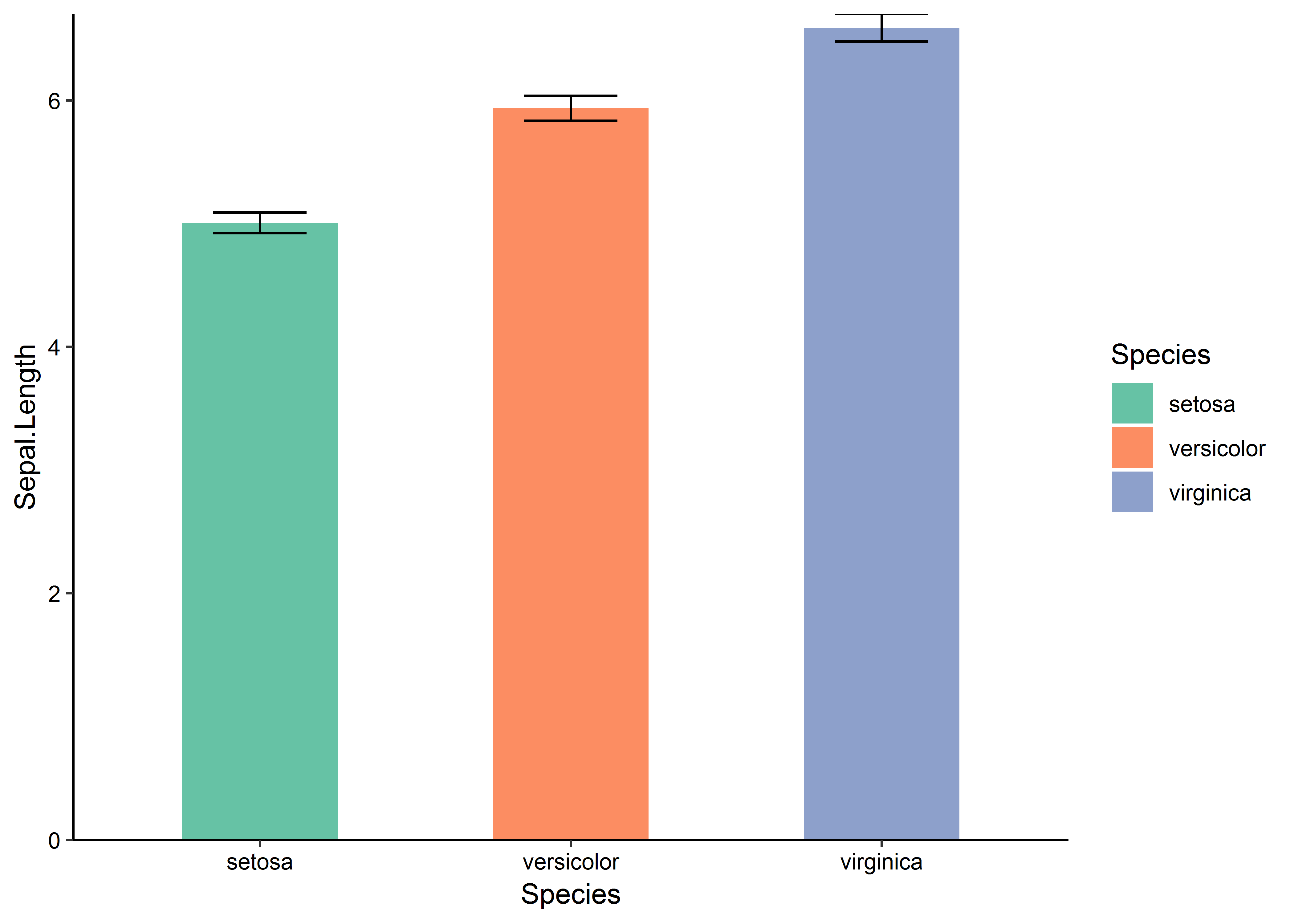
不过更多的时候,我是用直条图来进行数量上的对比:
population %>% filter(year == 2013) %>%
  top_n(12, population) %>%
  ggplot(aes(fct_reorder(country, population), population, fill = country)) +
  geom_col(width = .8) +
  geom_text(aes(label = str_c(round(population/100000000, 2), '亿')),
                nudge_y = -10000000) +
  coord_flip() +
  scale_y_continuous(labels = scales::comma) +
  scale_fill_brewer(palette = 'Set3') +
  labs(x = 'Country', y = 'Population') +
  theme_light() +
  theme(legend.position = 'none')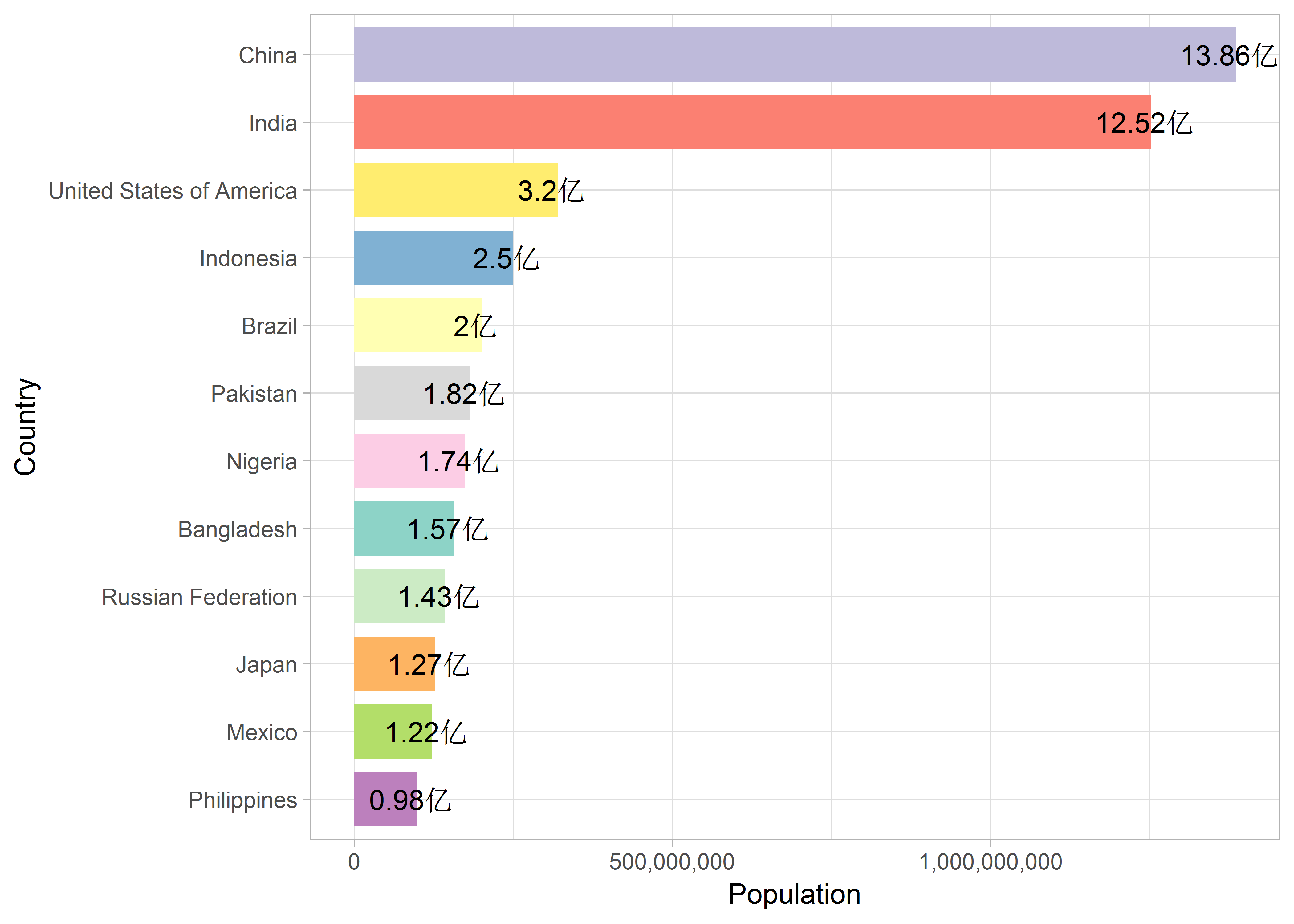
当然,也可以用在一些问卷调查结果的呈现上:
set.seed(181117)

df_ques <- tibble(item = letters[1:9],
                  satis = sample(30:50, 9, replace = TRUE),
                  unsatis = sample(30:50, 9, replace = TRUE)) %>%
  mutate(uncertain = 100 - satis - unsatis) %>%
  gather(choice, number, -item) %>%
  mutate(choice = fct_relevel(choice, c('satis', 'uncertain', 'unsatis')))

df_ques %>% ggplot(aes(fct_rev(item), number, fill = choice)) +
  geom_col(width = .5, position = 'fill') +
  coord_flip() +
  scale_fill_brewer(palette = 'Dark2',
                    breaks = c('unsatis', 'uncertain', 'satis'),
                    labels = c('不满意', '不确定', '满意')) +
  labs(x = '题  目', y = '比  例', fill = '选  项') +
  theme_base() +
  theme(legend.position = 'top')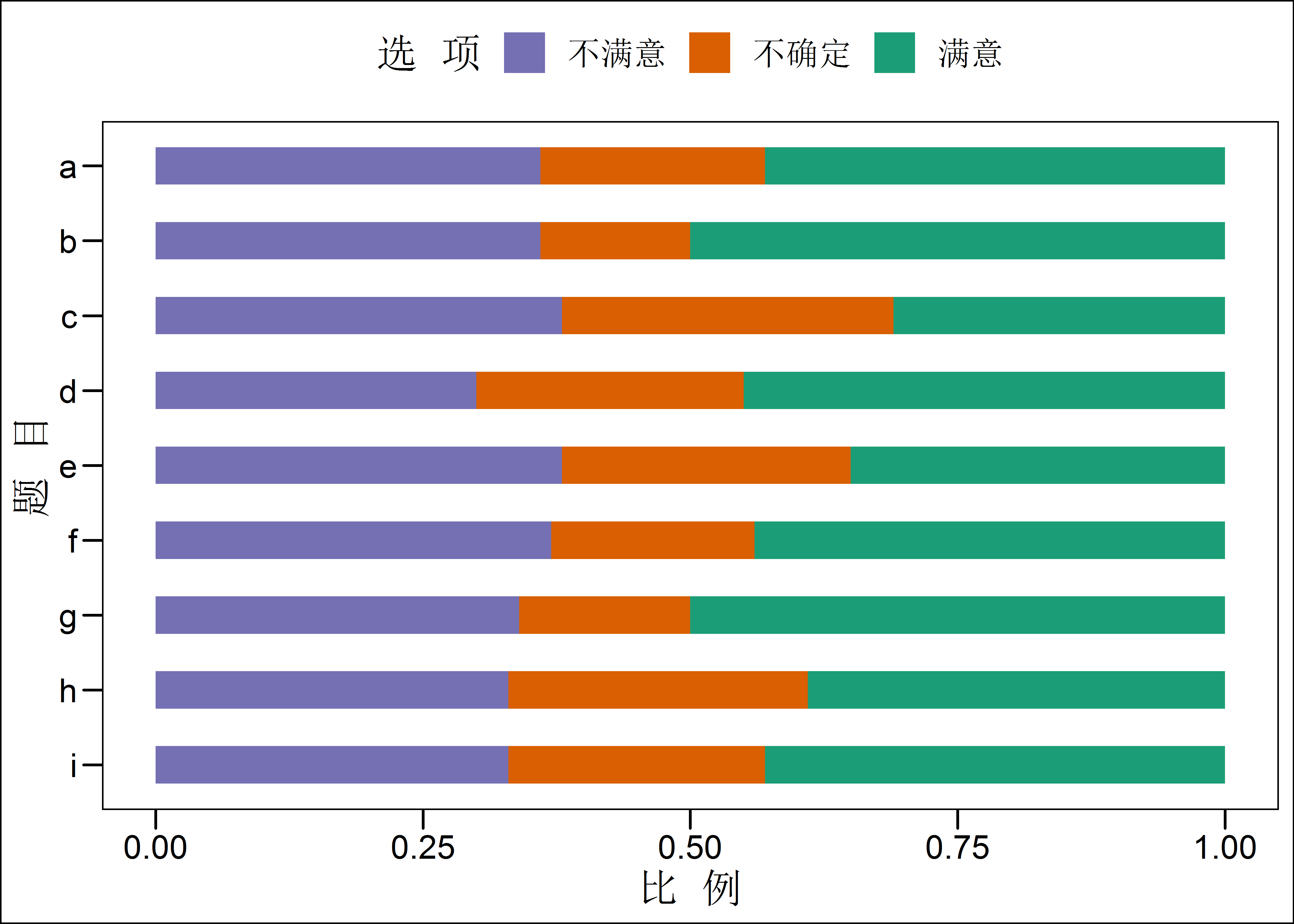
Box Plot
箱型图可以用来进行变量内的对比,也能查看异常值的情况,这里我还添加了jitter了的散点图:
iris %>% ggplot(aes(Species, Sepal.Length, fill = Species)) +
  geom_boxplot() +
  geom_point(position = position_jitter(width = .1), alpha = .5) +
  scale_fill_brewer(palette = 'Accent') +
  theme_bw()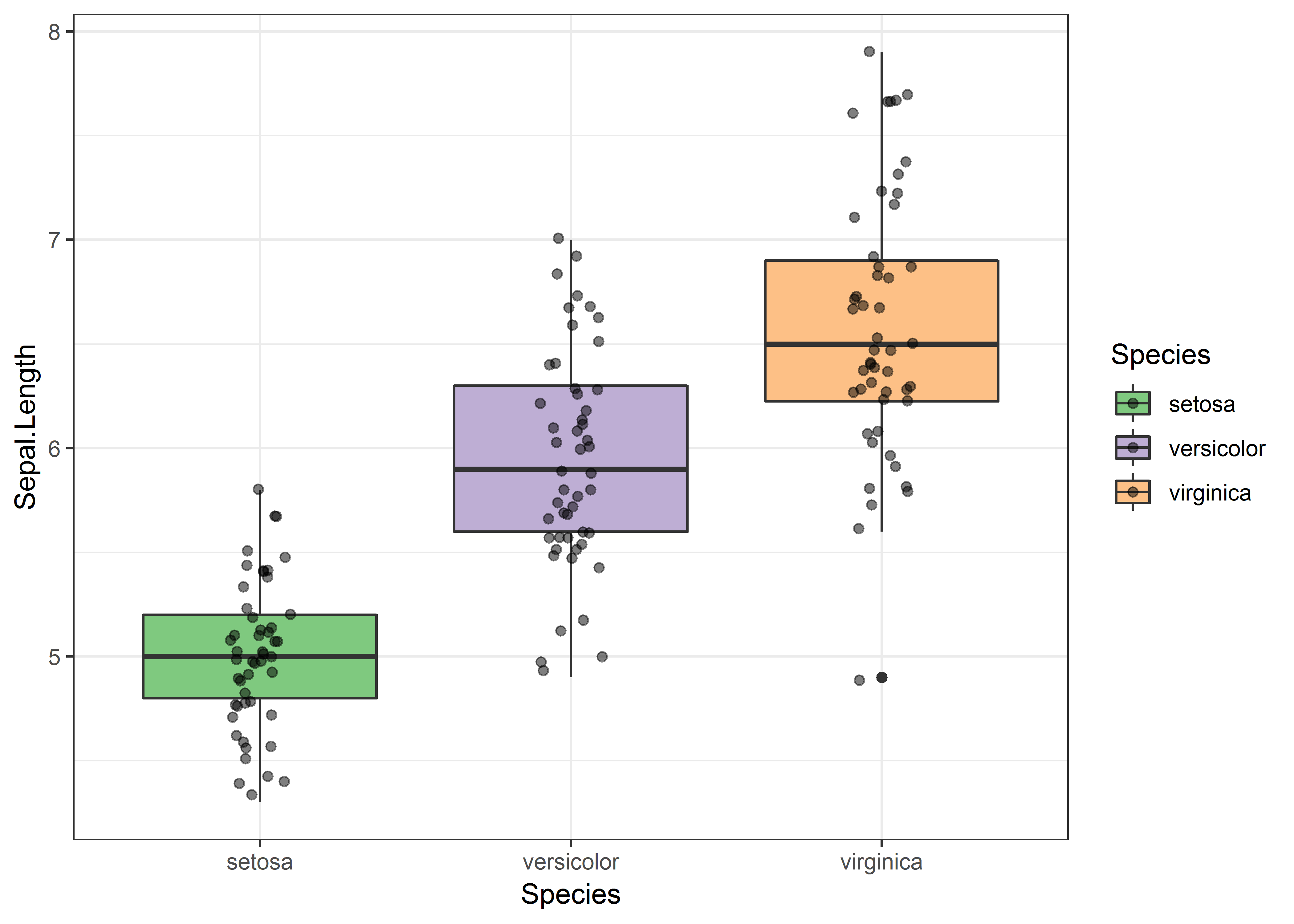
Heatmap
热力图可以参考我之前的文章看图写代码:瑞克与莫蒂剧集评分热力图。
Histgram
直方图可以用来查看数据的分布情况,但我目前还没有用到过,因此参考了下看过的文章,随便画了个:
set.seed(181118)

tibble(x = rnorm(10000)) %>%
  ggplot(aes(x, fill = cut(x, 100))) +
  geom_histogram(binwidth = .2) +
  scale_fill_discrete(h = c(180, 360), c = 150, l = 80) +
  theme_fivethirtyeight() +
  theme(legend.position = 'none')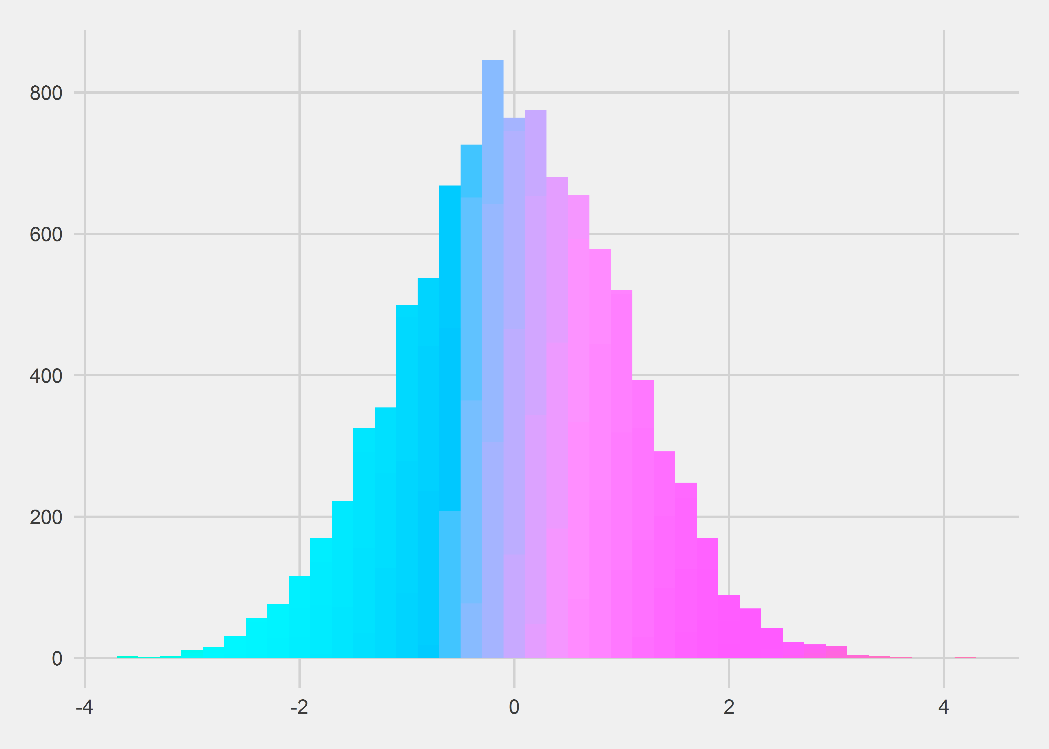
Line Chart
折线图一般用来描述数据随着时间的变化,这个我倒是经常用到:
population %>%
  filter(country %in% c('China', 'India', 'United States of America',
                        'Russian Federation', 'Japan')) %>%
  ggplot(aes(year, population, group = country, color = country)) +
  geom_line(size = 1.1) +
  geom_point(size = 2) +
  scale_y_continuous(breaks = seq(100000000, 1400000000, 100000000),
                     labels = seq(100, 1400, 100)) +
  scale_x_continuous(breaks = 1995:2013) +
  scale_color_brewer(palette = 'Set1') +
  labs(x = 'Year', y = 'Population (Million)') +
  theme_tufte() +
  theme(legend.position = 'bottom')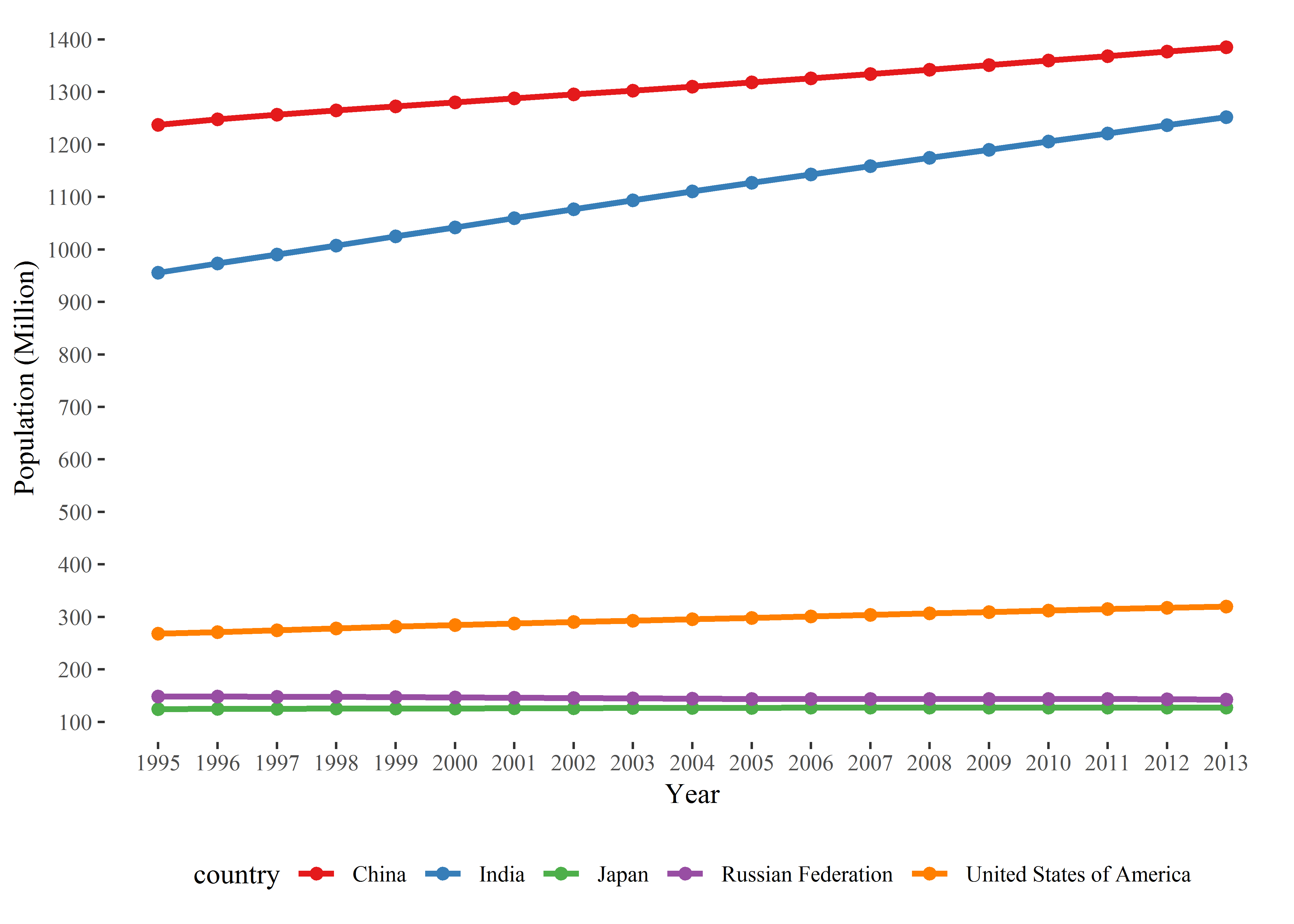
Map
以前以所在学院同年毕业的研究生地理信息数据画过一张地图,放在这里:
library(maptools)

jky <- read.csv('jky.csv', stringsAsFactors = FALSE)

china_map <- readShapePoly("bou2_4p.shp")

map_data <- china_map@data %>%
  mutate(id = row.names(.)) %>%
  full_join(fortify(china_map))

jky_region <- jky %>% group_by(region) %>%
  summarise(N = n()) %>%
  full_join(map_data, by = c('region' = 'NAME'))

china_label <- read.csv('province.txt', stringsAsFactors = FALSE,
                        header = FALSE) %>%
  select(region = 1, long = 4, lat = 5)

ggplot(jky_region, aes(long, lat)) +
  geom_polygon(aes(group = group, fill = N), color = '#AAAAAA',
               size = .2) +
  geom_text(aes(long, lat, label = region), data = china_label,
            size = 3, color = 'red') +
  coord_map('polyconic') +
  scale_fill_continuous(low = 'lightblue', high = 'blue',
                        breaks = c(5, 10, 15, 20, 25, 29),
                        labels = c('01-05', '05-09', '10-14',
                                   '15-19', '20-24', '25-29')) +
  scale_x_continuous(limits = c(73, 137)) +
  scale_y_continuous(limits = c(15, 55)) +
  theme_void() +
  labs(fill = '人  数') +
  theme(plot.title = element_text(size = 24, hjust = .5, vjust = -20),
        legend.position = c(.16, .25),
        legend.title = element_text(hjust = .4)) +
  guides(fill = guide_legend(reverse = TRUE, ncol = 2))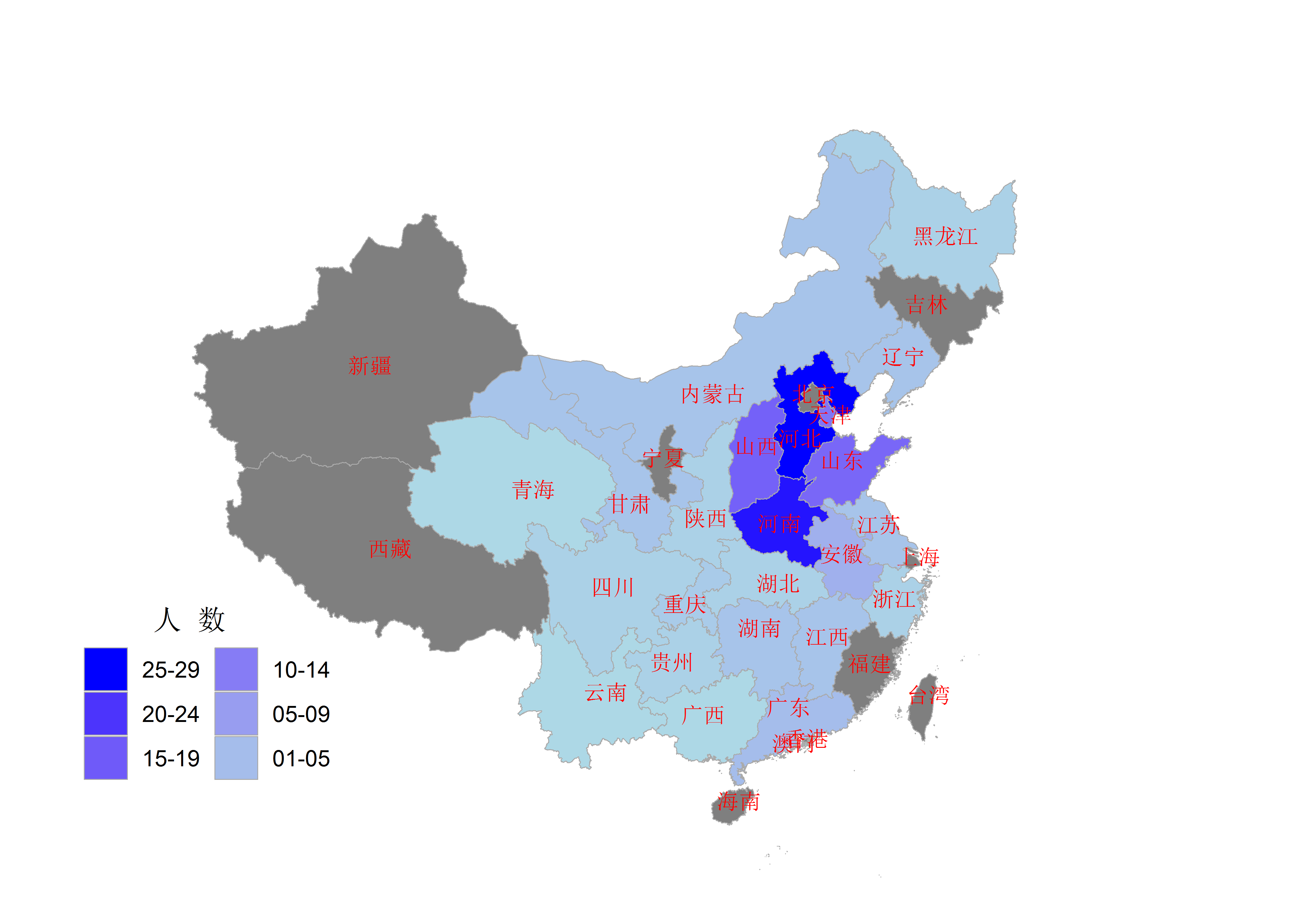
感觉这个中国地图不是很好看,世界地图就要好多了:
library(rvest)
library(scales)

df_oil <- read_html("https://en.wikipedia.org/wiki/List_of_countries_by_oil_production") %>%
  html_nodes("table") %>%
  .[[1]] %>%
  html_table() %>%
  select(rank = 1, country = 2, oil_bbl_per_day = 3) %>%
  mutate(rank = as.integer(rank),
         oil_bbl_per_day = str_replace_all(oil_bbl_per_day, ",", ""),
         oil_bbl_per_day = as.integer(oil_bbl_per_day),
         opec_ind = if_else(str_detect(country, "OPEC"), 1, 0),
         country = str_replace(country, "\\(OPEC\\)", ""),
         country = str_replace(country, "\\s{2,}", " ")) %>%
  select(1, 2, 4, 3)

map_world <- map_data("world")

df_oil <- df_oil %>%
  mutate(country = recode(country, `United States` = 'USA',
                          `United Kingdom` = 'UK',
                          `Congo, Democratic Republic of the` = 'Democratic Republic of the Congo',
                          `Trinidad and Tobago` = 'Trinidad',
                          `Sudan and South Sudan` = 'Sudan',
                          `Sudan and  South Sudan` = 'South Sudan',
                          `Congo, Republic of the` = 'Republic of Congo'))

map_oil <- left_join(map_world, df_oil, by = c("region" = "country"))

ggplot(map_oil, aes(long, lat, group = group)) +
  geom_polygon(aes(fill = oil_bbl_per_day)) +
  scale_fill_gradientn(colours = c('#461863','#404E88','#2A8A8C','#7FD157','#F9E53F'),
                       values = rescale(c(100,96581,822675,3190373,10000000)),
                       labels = comma,
                       breaks = c(100,96581,822675,3190373,10000000)) +
  guides(fill = guide_legend(reverse = TRUE)) +
  labs(fill = "bbl/day", title = "Oil Production by Country",
       subtitle = "Barrels per day, 2016", x = NULL, y = NULL) +
  theme(text = element_text(color = "#EEEEEE"),
        plot.title = element_text(size = 28),
        plot.subtitle = element_text(size = 14),
        axis.ticks = element_blank(),
        axis.text = element_blank(),
        panel.grid = element_blank(),
        panel.background = element_rect(fill = "#333333"),
        plot.background = element_rect(fill = "#333333"),
        legend.position = c(.18, .36),
        legend.background = element_blank(),
        legend.key = element_blank()) +
  annotate(geom = "text",
           label = "Source: U.S. Energy Information Administration\nhttps://en.wikipedia.org/wiki/List_of_countries_by_oil_production",
           x = 18, y = -55, size = 3, color = "#CCCCCC", hjust = "left")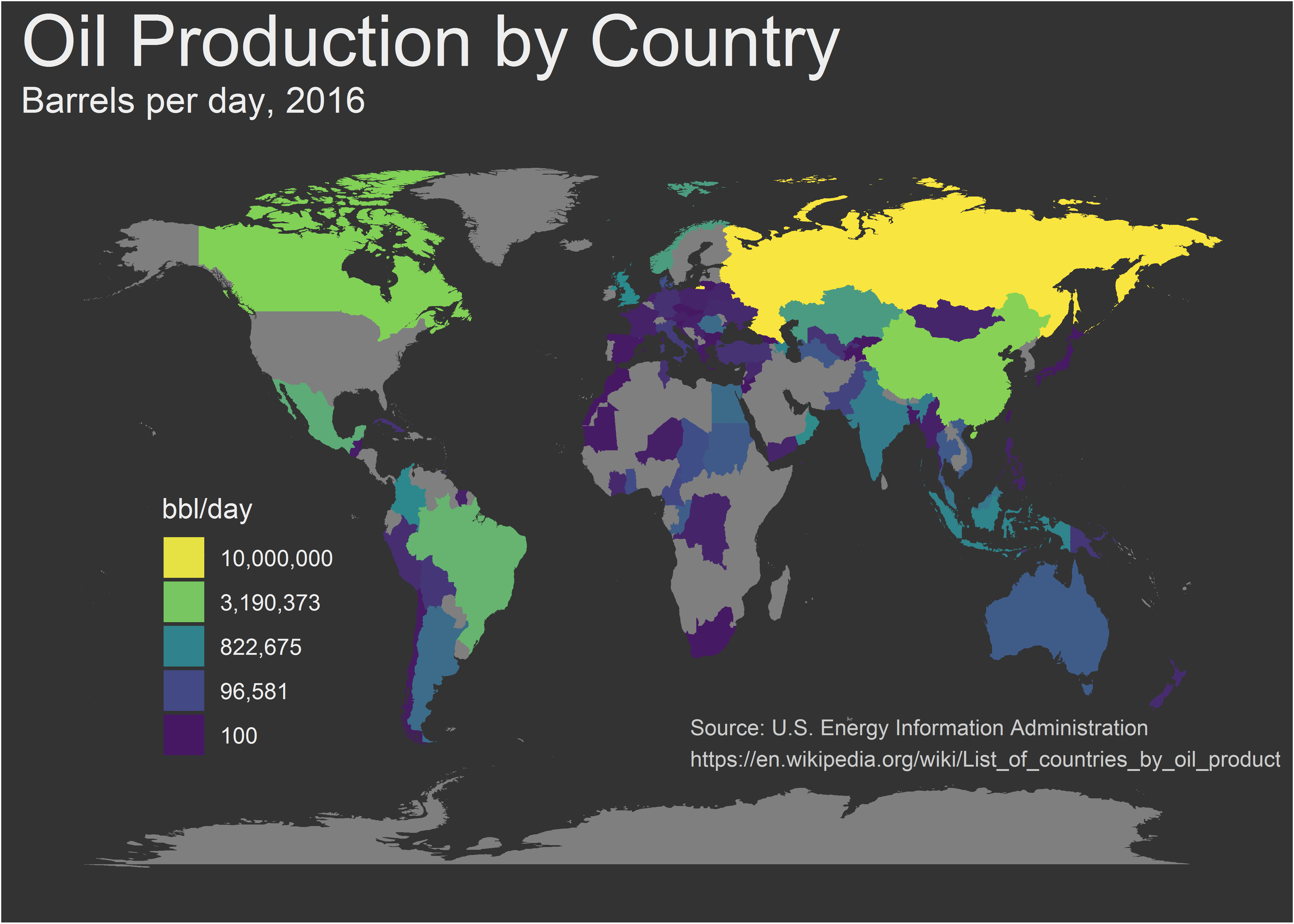
上图的代码是以前在一个名叫Sharp Sight的网站上看到的,不知道为什么,这个网站现在打不开了。当时看到这幅图真是感到不可思议,但现在来看,也是稀松平常。
Pie Chart
饼图其实就是直条图经过了极坐标的转化形成的,因为人对面积大小的区分能力不如对长度的区分能力,所以一般不推荐用饼图:
iris %>% count(Species) %>%
  ggplot(aes('', n, fill = Species)) +
  geom_col(position = 'fill') +
  geom_text(aes(label = str_c(str_to_title(Species), ':\n', n)),
            position = position_fill(vjust = .5)) +
  coord_polar(theta = 'y') +
  scale_fill_brewer(palette = 'Pastel1') +
  theme_void() +
  theme(legend.position = 'none')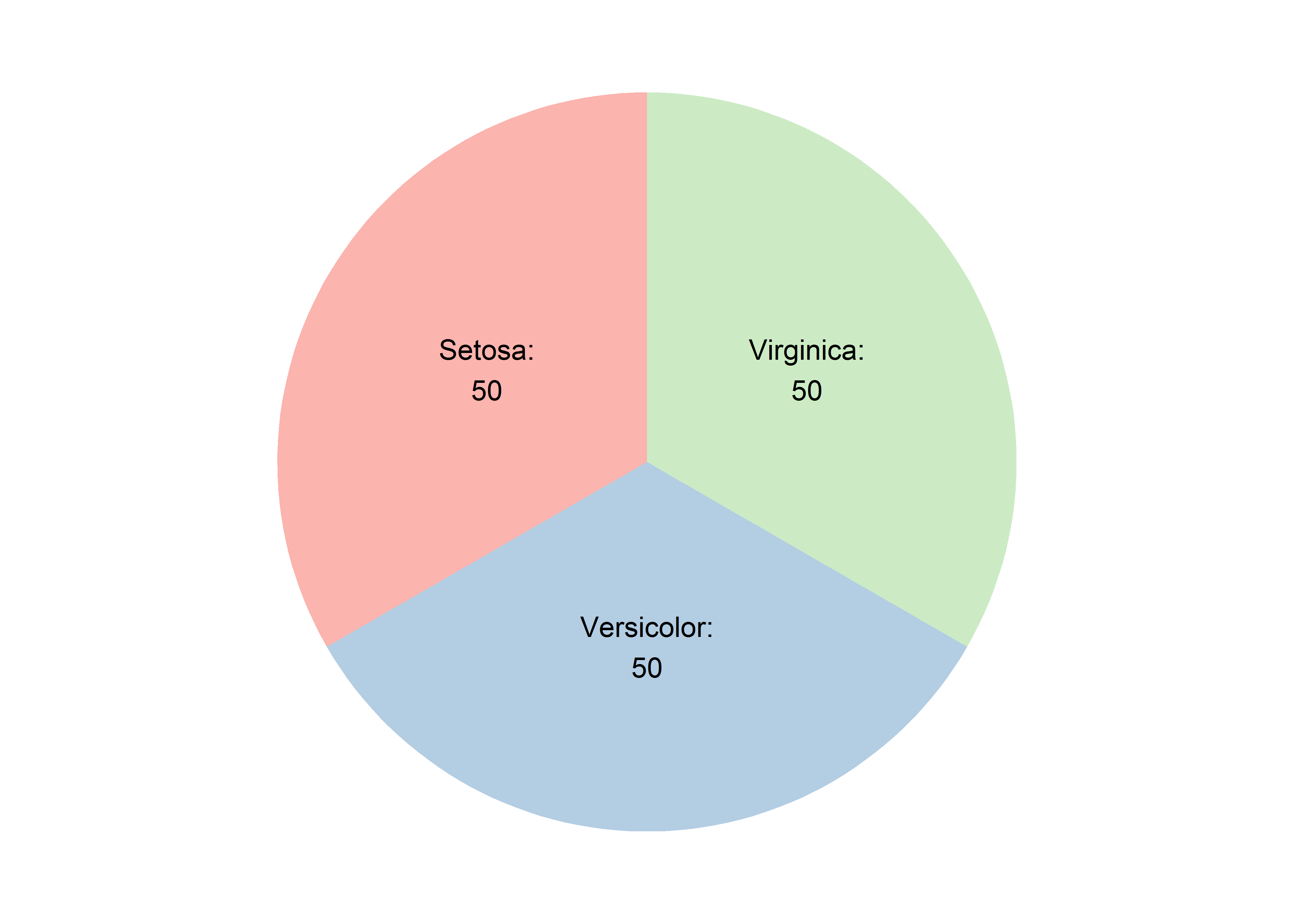
以前对于给饼图贴标签的问题,颇下了一番功夫,但实际上ggplot2里自带了解决办法。另外,如果有多个直条图的话,饼图就可以变成旭日图(sunburst graph):
iris %>% count(Species) %>%
  mutate(hierarchy = 'b') %>%
  add_row(Species = 'total', n = 150, hierarchy = 'a', .before = 1) %>%
  ggplot(aes(hierarchy, n, fill = Species)) +
  geom_col(position = 'fill') +
  geom_text(aes(label = str_c(str_to_title(Species), ':\n', n)),
            position = position_fill(vjust = .5)) +
  coord_polar(theta = 'y') +
  scale_fill_brewer(palette = 'Pastel1') +
  theme_void() +
  theme(legend.position = 'none')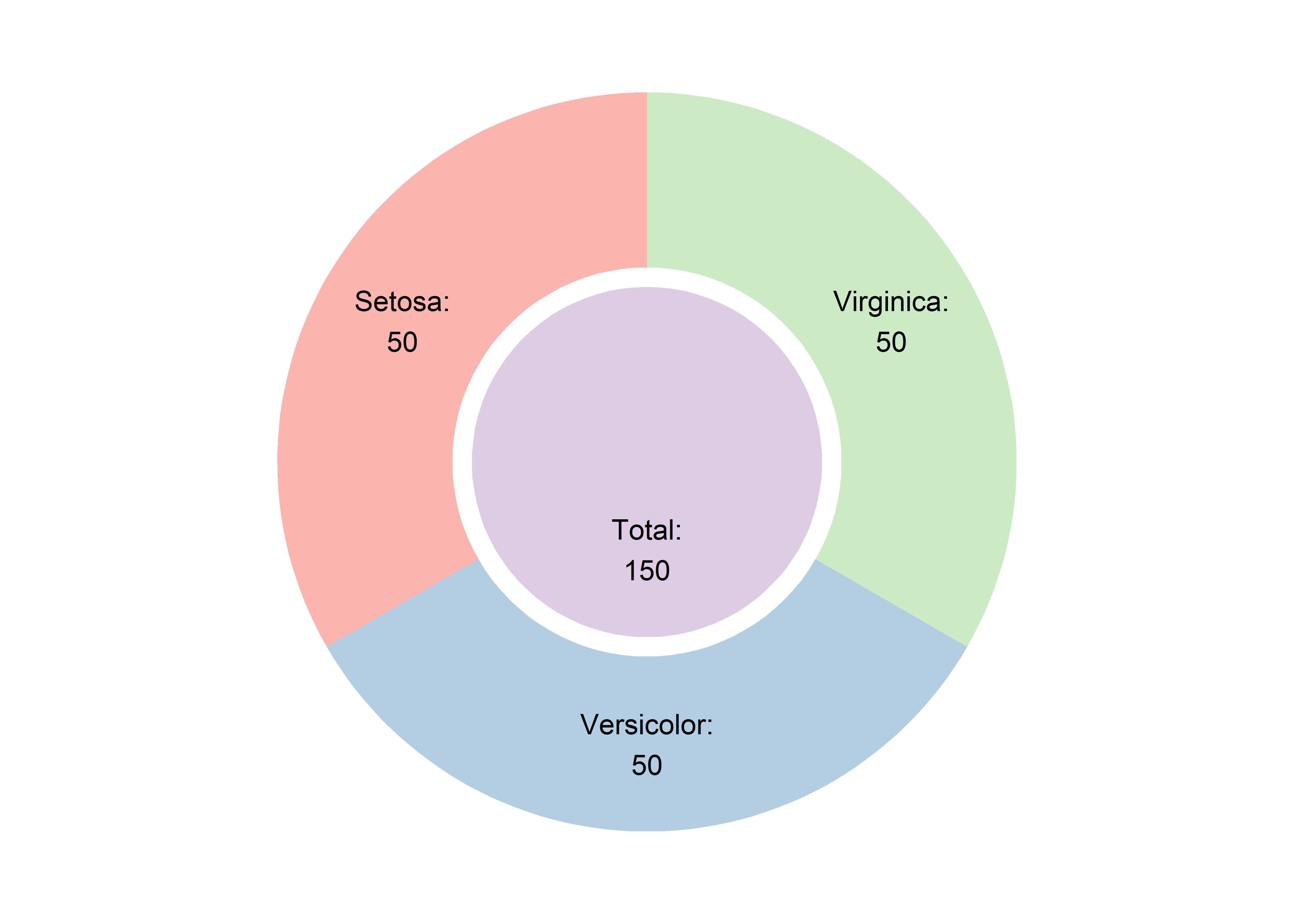
Radar Chart
雷达图经常用来呈现游戏人物的能力属性,我特意找了三国志中三位君主的属性数据(花了好多时间才找到,就没有硬核玩家来整理这些资料吗?),来呈现雷达图,用到的包是ggplot2的扩展包ggradar:
library(ggradar)

df_tk <- tibble(姓名 = c('曹操', '刘备', '孙权'),
                统率 = c(99, 81, 79),
                武力 = c(72, 77, 67),
                智力 = c(91, 78, 80),
                政治 = c(94, 80, 89)) %>%
  mutate_if(is.numeric, funs(./100))

df_tk %>% ggradar(axis.label.size = 5,
                  group.point.size = 3,
                  grid.label.size = 0) +
  scale_color_manual(values = c('blue', 'green', 'red')) +
  theme(legend.text = element_text(size = 10),
        legend.position = 'right')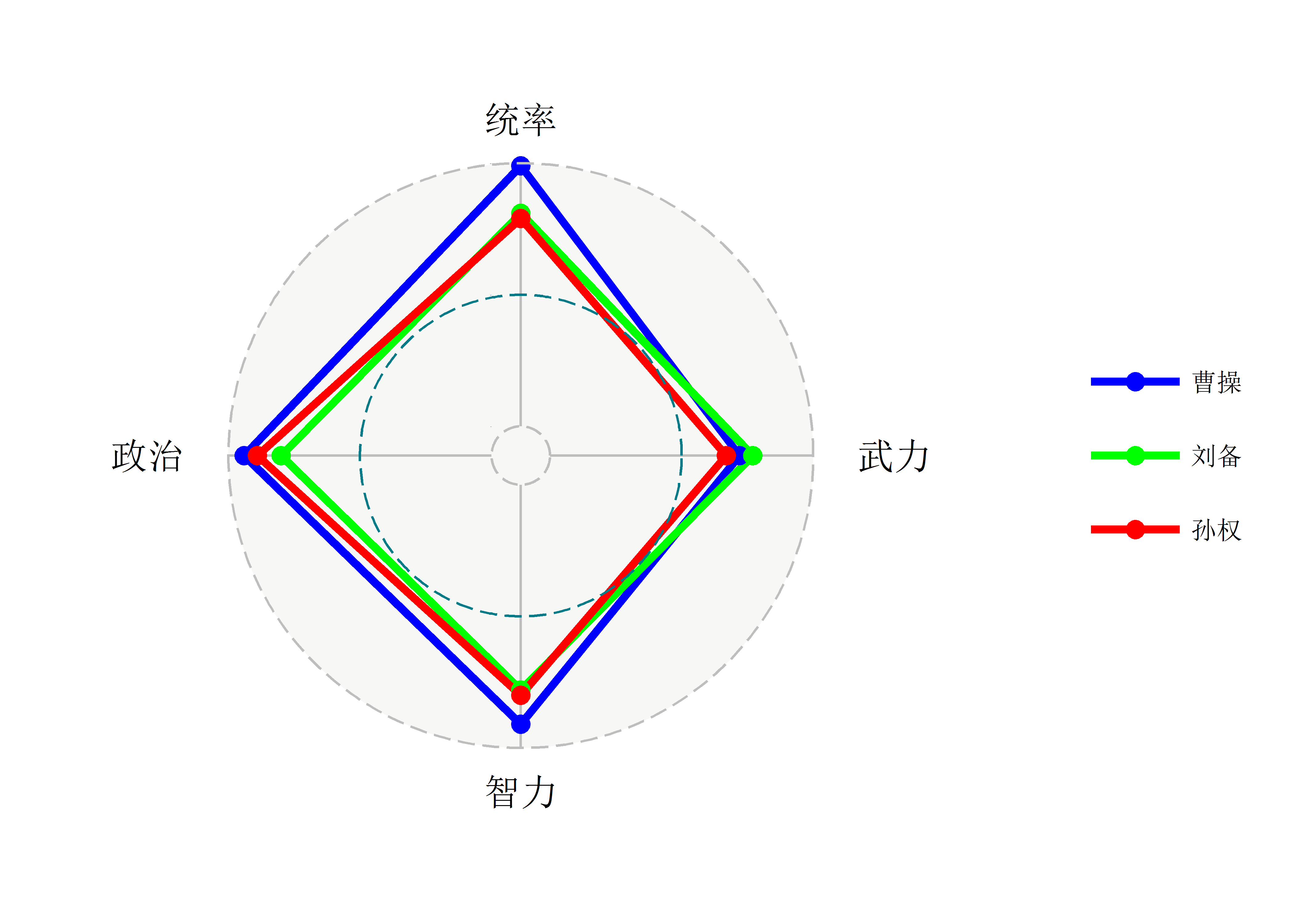
感觉非常不理想,我又试了下radarchart包,这个包并不是ggplot2的扩展包,但呈现的结果要好一点,而且还有一定的交互性-把鼠标放到点上时会显示对应的信息:
library(radarchart)

tibble(label = c('统率', '武力', '智力', '政治'),
       孙权 = c(79, 67, 80, 89),
       刘备 = c(81, 77, 78, 80),
       曹操 = c(99, 72, 91, 94)) %>%
  chartJSRadar(maxScale = 100, showToolTipLabel = TRUE)
Scatter Plot
散点图常用来描绘两个数值型变量之间的关系,有时候关系是一样的,但内容可能截然不同:
tibble(id = c(rep(1:11, each = 4)), set = rep(1:4, 11),
       x = c(t(anscombe[,1:4])), y = c(t(anscombe[,5:8]))) %>%
  ggplot(aes(x, y)) +
  geom_point() +
  geom_smooth(method = "lm", se = FALSE) +
  facet_wrap(~ set) +
  theme_light() +
  labs(title = "Anscombe's quartet")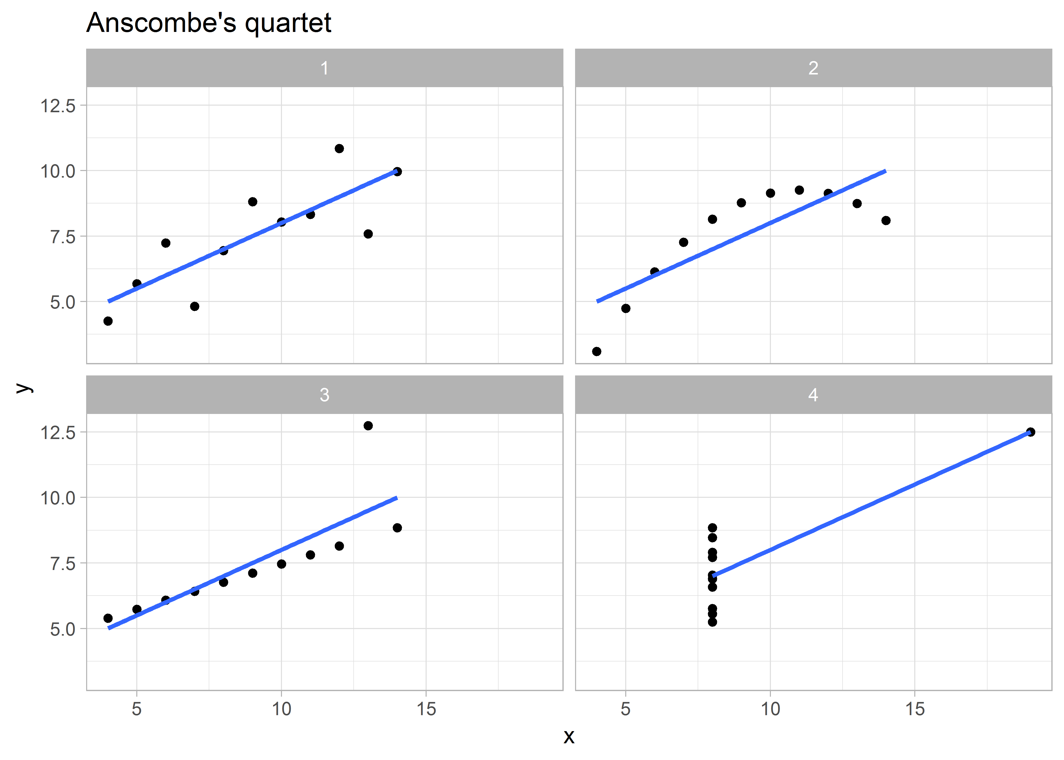
当把数据中的某个变量映射到点的大小上时,散点图就变成了气泡图:
library(gapminder)
library(ggrepel)

gapminder %>% filter(year == 2007) %>%
  top_n(12, pop) %>%
  ggplot(aes(gdpPercap, lifeExp)) +
  geom_point(aes(size = pop, color = pop), show.legend = FALSE) +
  geom_text_repel(aes(label = country)) +
  scale_size_continuous(range = c(2, 10)) +
  scale_color_continuous_tableau(palette = 'Orange') +
  theme_minimal()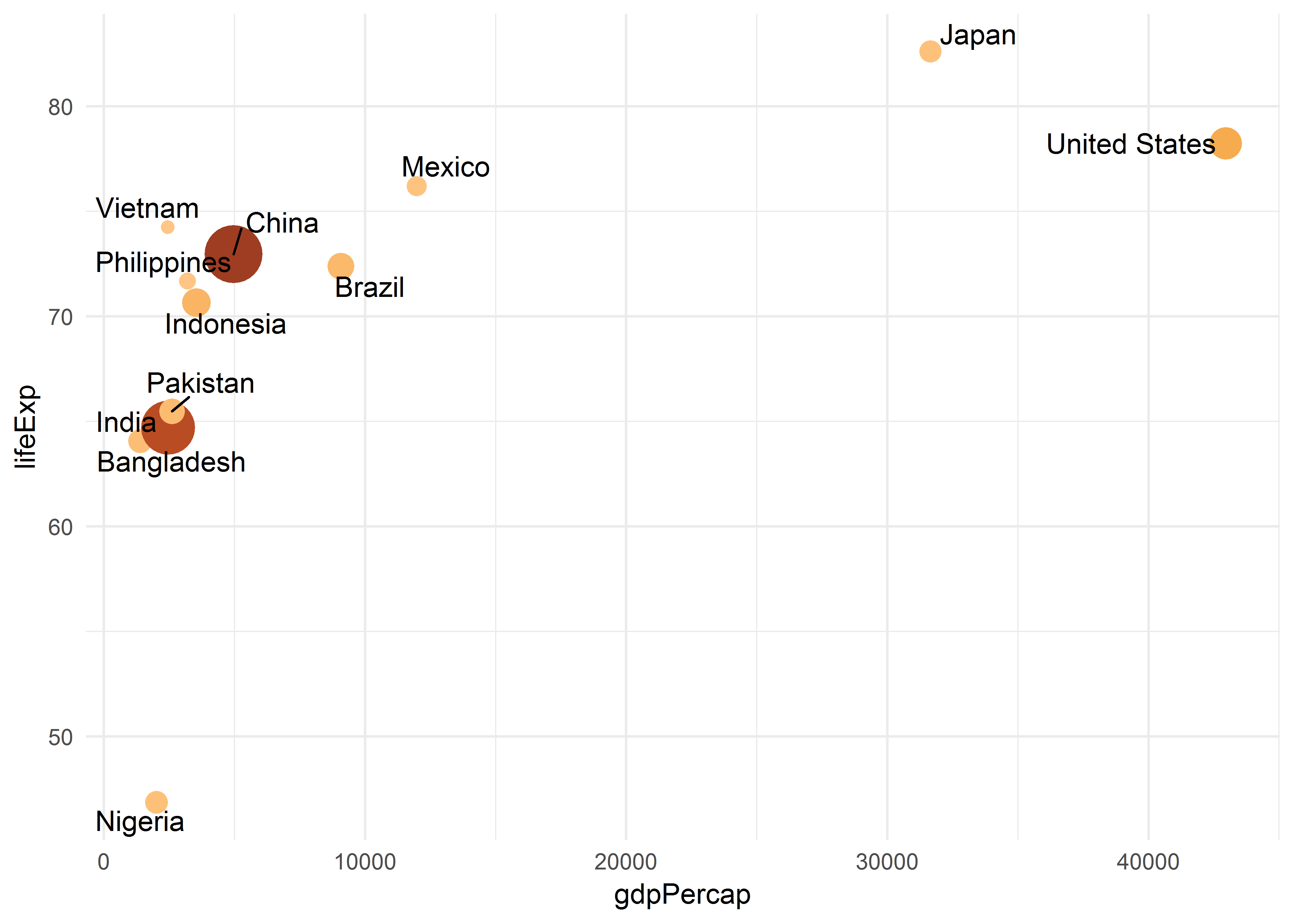
Treemap
树状图可以用来展示文字的频次,在文字的数量不是很多的情况下,比词汇云要好一点:
library(tidytext)
library(treemapify)

set.seed(181117)

df_col <- tibble(color = sample(colors(), 15, replace = FALSE),
                 n = sample(10:1000, 15)) %>%
  arrange(color)

df_col %>%
  ggplot(aes(area = n, fill = color)) +
  geom_treemap() +
  geom_treemap_text(aes(label = str_c(df_col$color, ':\n', df_col$n)),
                    place = 'center') +
  scale_fill_manual(values = c("aliceblue", "burlywood2", "gray34", "gray37",
                               "gray51", "gray80", "green", "green4",
                               "grey29", "lightcyan4", "lightgoldenrod3",
                               "maroon2", "mediumslateblue", "tan3", "tomato4" )) +
  theme(legend.position = 'none')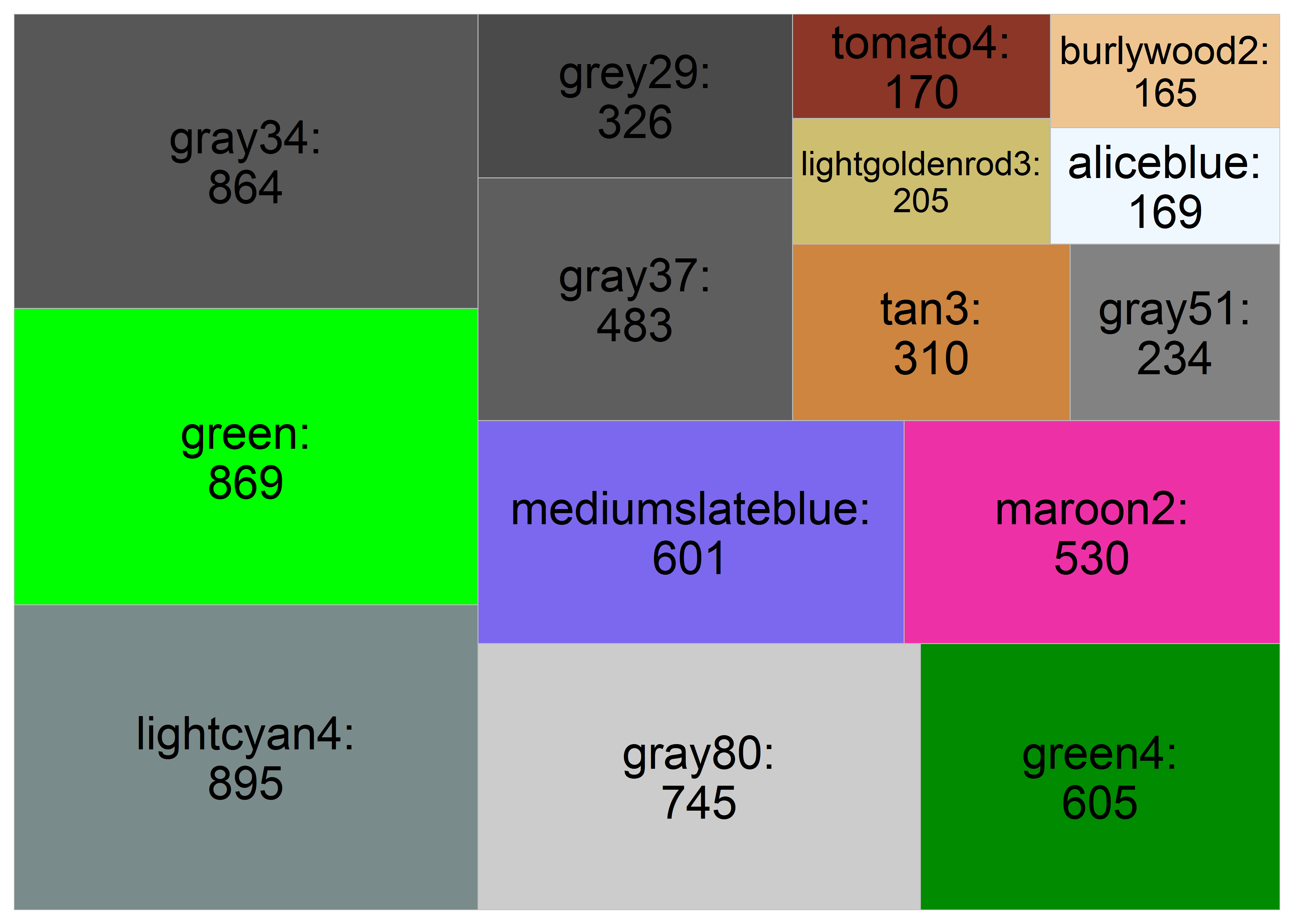
因子型的数据有时候挺难搞的,这里就没找到好办法,最后干脆全列了出来,以后再想办法解决这个问题吧。

