
看图写代码:瑞克与莫蒂剧集评分热力图
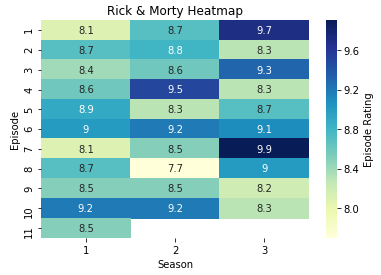
大概是去年的这个时间,我在一个名叫Data Is Beautiful的reddit论坛上看到了一张Rick and Morty的分集评分热力图,就想用R把它重复出来。当时水平还不怎么样,只能画个大概出来,很多细节都不知道该如何呈现;前几个月,又重新尝试了下,大部分细节都知道该如何实现了,但还是差一点;这里再尝试一下,看看能不能完全重复出来,毕竟这张图应该就是用R画的。
图是这样的:
首先,还是先把需要用到的包载入:
library(tidyverse)然后载入数据:
rm <- read_csv("rick & morty.csv") %>%
  mutate_at(vars(Episode, Season), as.factor)
载入数据的时候,为方便后面的绘图,顺便把集数和季数两个变量改成了因子型。具体的数据是这样的:
rm## # A tibble: 31 x 3
## Episode Season Rating
## <fct> <fct> <dbl>
## 1 1 1 8.1
## 2 2 1 8.7
## 3 3 1 8.4
## 4 4 1 8.6
## 5 5 1 8.9
## 6 6 1 9
## 7 7 1 8.1
## 8 8 1 8.7
## 9 9 1 8.5
## 10 10 1 9.2
## # ... with 21 more rows数据很简单,Episode变量指第几集,Season变量指第几季,rating变量指该集的评分。
接下来先把最基本的框架画出来,然后再一点一点的完善。这个框架,三行代码就足够了:
ggplot(rm, aes(Season, Episode, fill = Rating)) +
  geom_tile() +
  geom_text(aes(label = Rating))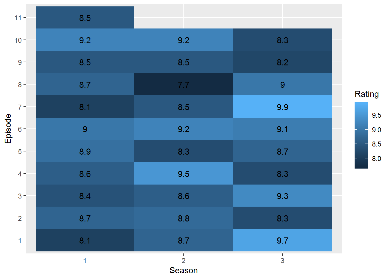
这里,将Season变量映射到了X轴上,同时将Episode变量映射到了Y轴上,并将Rating变量映射到了fill(填充色)上;然后通过geom_tile函数,将几何形状设置为瓦片图;最后再通过geom_text函数将评分的具体数字映射到相应的位置上。
图是画出来了,但跟原图差距还挺大的。首先,从Y轴来看,原图从上到下是递增的,而我这里是递减的。解决这个问题,不需要再多加一行代码,只需要稍作修改:
ggplot(rm, aes(Season, fct_rev(Episode), fill = Rating)) +
  geom_tile() +
geom_text(aes(label = Rating)) 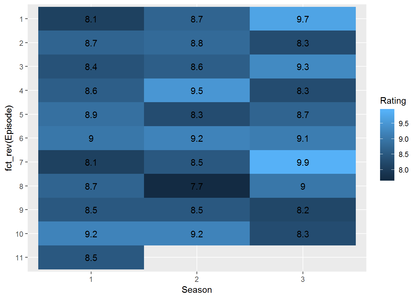
使用forcats包里的fct_rev函数,可以颠倒因子水平的顺序,不过这也改变了Y轴的名称。下面统一把坐标轴、标题以及图例的名称更改掉:
ggplot(rm, aes(Season, fct_rev(Episode), fill = Rating)) +
  geom_tile() +
  geom_text(aes(label = Rating)) +
labs(title = "Rick & Morty Heatmap", y = 'Episode', fill = 'Episode Rating') 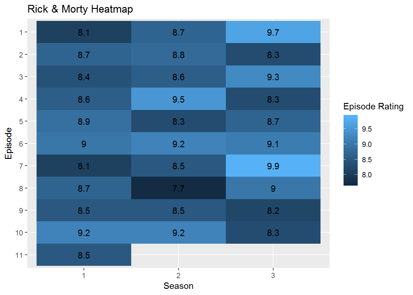
labs函数可以用来修改各种名称,值得注意的是,如果前面用了fill,这里也要用fill;前面用了color,这里也要用color。提起颜色,我这里的颜色跟原图的颜色显然不一样,而且原图是分数越高颜色越深,而我正好相反。我试着以原图图例中8分的颜色为起始色,8.8分的颜色为中间色,9.9分的颜色为终点色来重复原图使用的颜色,这次用上了scale_fill_gradient2函数:
ggplot(rm, aes(Season, fct_rev(Episode), fill = Rating)) +
  geom_tile() +
  geom_text(aes(label = Rating)) +
  labs(title = "Rick & Morty Heatmap", y = 'Episode', fill = 'Episode Rating') +
    scale_fill_gradient2(low = '#ECF7B1', mid = '#3FB4C4', high = '#081D58',
                        midpoint = 8.8, breaks = seq(10, 8, -.4))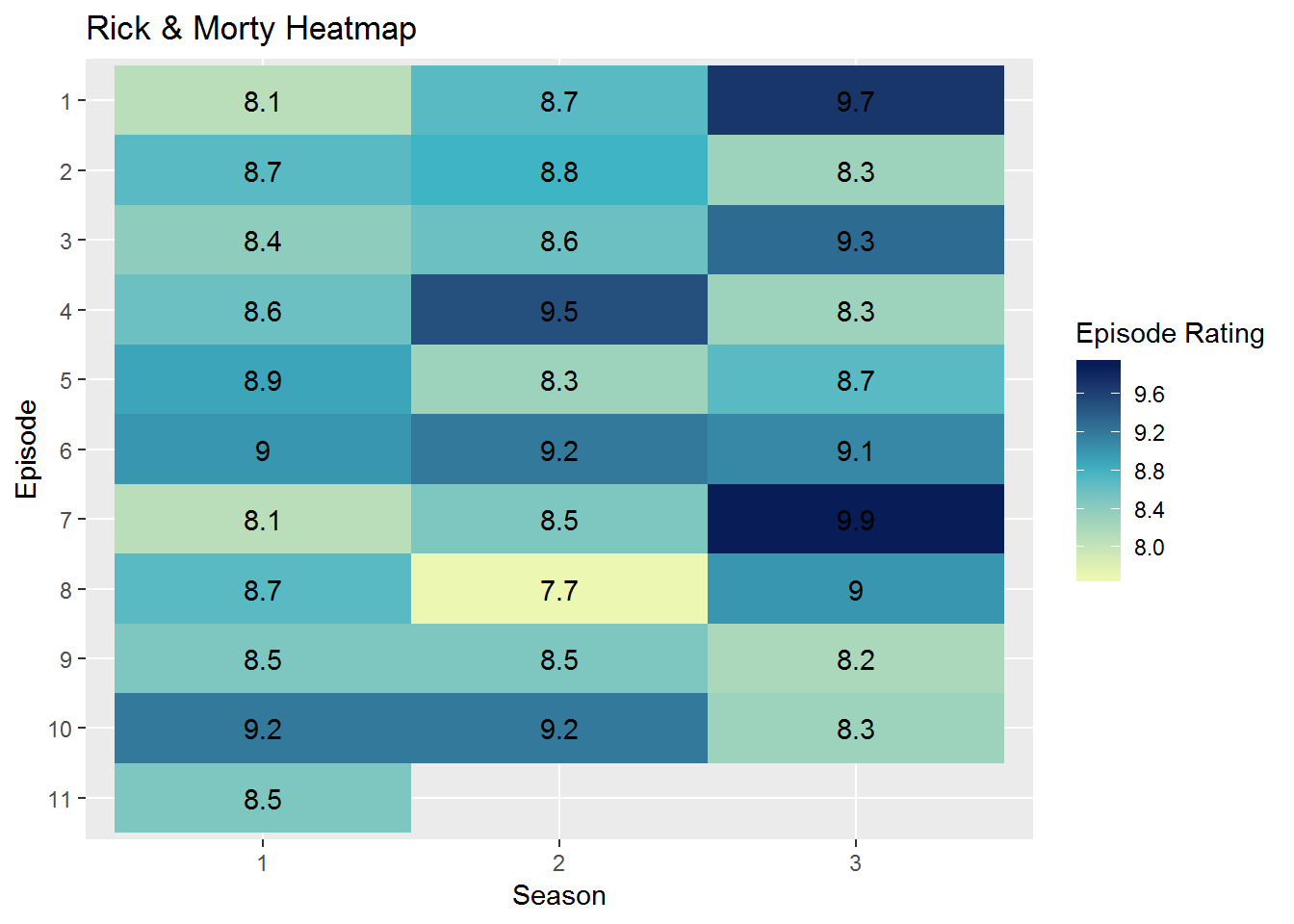
呃,不是完全一样,花了好多时间也没试出来完全符合原图的颜色,就先这样了。下面处理一下评分文本的颜色。原图中,深色瓦片上的文字是白色的,这一点很容易做到:
ggplot(rm, aes(Season, fct_rev(Episode), fill = Rating)) +
  geom_tile() +
  geom_text(aes(label = Rating),
            color = ifelse(rm$Rating > 8.7, 'white', 'black')) +
  labs(title = "Rick & Morty Heatmap", y = 'Episode', fill = 'Episode Rating') +
    scale_fill_gradient2(low = '#ECF7B1', mid = '#3FB4C4', high = '#081D58',
                        midpoint = 8.8, breaks = seq(10, 8, -.4))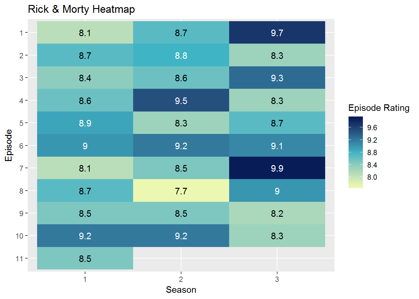
在geom_text函数中,使用ifelse函数指定分数大于8.7就呈现为白色,不超过8.7就呈现为黑色。
继续。原图中Y轴的刻度是紧挨着瓦片的,加一行代码就可以实现:
ggplot(rm, aes(Season, fct_rev(Episode), fill = Rating)) +
  geom_tile() +
  geom_text(aes(label = Rating),
            color = ifelse(rm$Rating > 8.7, 'white', 'black')) +
  labs(title = "Rick & Morty Heatmap", y = 'Episode', fill = 'Episode Rating') +
    scale_fill_gradient2(low = '#ECF7B1', mid = '#3FB4C4', high = '#081D58',
                        midpoint = 8.8, breaks = seq(10, 8, -.4)) +
  scale_x_discrete(expand = c(0, 0))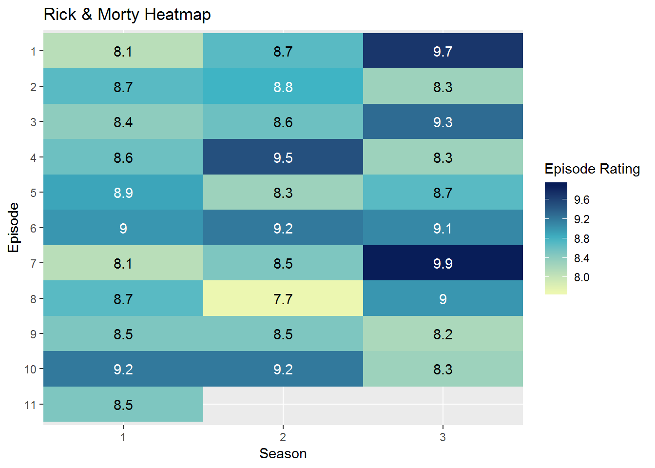
scale_x_discrete函数可以针对离散型的X轴进行调整,然后通过其中的expand参数,可以调整刻度与瓦片之间的距离。
然后将这张图的标题居中,这需要通过theme函数实现:
ggplot(rm, aes(Season, fct_rev(Episode), fill = Rating)) +
  geom_tile() +
  geom_text(aes(label = Rating),
            color = ifelse(rm$Rating > 8.7, 'white', 'black')) +
  labs(title = "Rick & Morty Heatmap", y = 'Episode', fill = 'Episode Rating') +
    scale_fill_gradient2(low = '#ECF7B1', mid = '#3FB4C4', high = '#081D58',
                        midpoint = 8.8, breaks = seq(10, 8, -.4)) +
  scale_x_discrete(expand = c(0, 0)) +
  theme(plot.title = element_text(hjust = 0.5))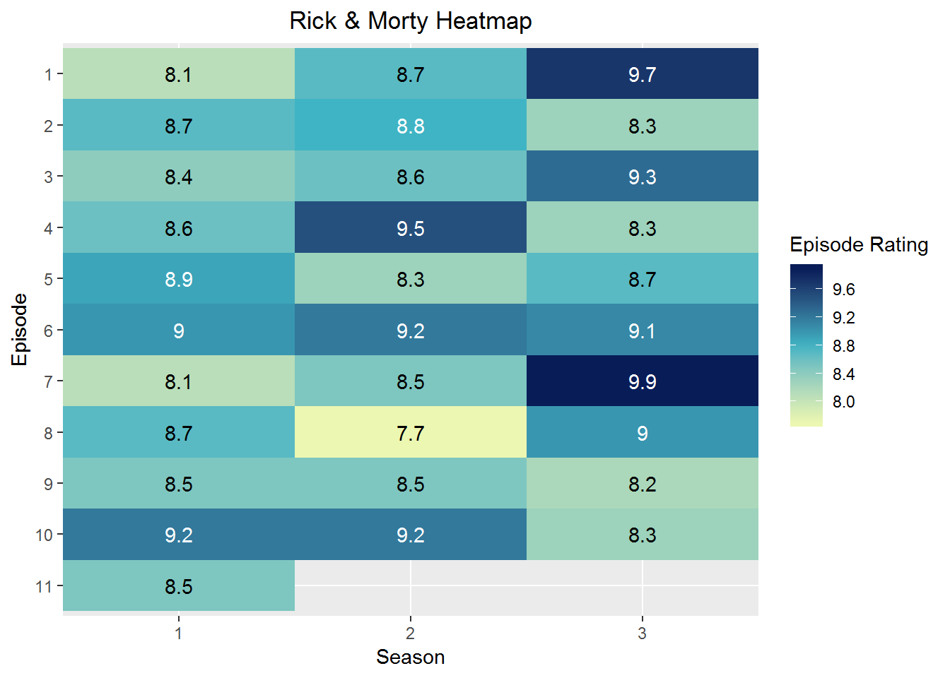
plot.title参数自然就是指图的标题,随后的element_text参数指对该部分的文本进行操作,其中的hjust参数用来调节水平位置,0是左对齐,1是右对齐,默认是左对齐。
在theme函数中,可以针对很多细节进行调节,下面继续对Y轴刻度值的角度进行调整:
ggplot(rm, aes(Season, fct_rev(Episode), fill = Rating)) +
  geom_tile() +
  geom_text(aes(label = Rating),
            color = ifelse(rm$Rating > 8.7, 'white', 'black')) +
  labs(title = "Rick & Morty Heatmap", y = 'Episode', fill = 'Episode Rating') +
    scale_fill_gradient2(low = '#ECF7B1', mid = '#3FB4C4', high = '#081D58',
                        midpoint = 8.8, breaks = seq(10, 8, -.4)) +
  scale_x_discrete(expand = c(0, 0)) +
  theme(plot.title = element_text(hjust = 0.5),
        axis.text.y = element_text(angle = 90, hjust = .5))
axis.text.y参数是用来针对Y轴文本进行操作的,随后,在element_text中,使用angle调整角度,并再一次使用hjust将文本居中。
下面针对图片的背景进行调整。原图底层是一片空白,而ggplot2默认的背景是淡灰色加上白色的线条,这里可以用rect参数进行修改:
ggplot(rm, aes(Season, fct_rev(Episode), fill = Rating)) +
  geom_tile() +
  geom_text(aes(label = Rating),
            color = ifelse(rm$Rating > 8.7, 'white', 'black')) +
  labs(title = "Rick & Morty Heatmap", y = 'Episode', fill = 'Episode Rating') +
    scale_fill_gradient2(low = '#ECF7B1', mid = '#3FB4C4', high = '#081D58',
                        midpoint = 8.8, breaks = seq(10, 8, -.4)) +
  scale_x_discrete(expand = c(0, 0)) +
  theme(plot.title = element_text(hjust = 0.5),
        axis.text.y = element_text(angle = 90, hjust = .5),
        rect = element_blank())
element_blank就是什么都不画。
剩下的细节问题主要就是图例方面的了,图例应该更长一点,图例的标题应该在右侧,图例的刻度应该在图例条的外侧,且只需要右侧的一条。下面先把图例拉长:
ggplot(rm, aes(Season, fct_rev(Episode), fill = Rating)) +
  geom_tile() +
  geom_text(aes(label = Rating),
            color = ifelse(rm$Rating > 8.7, 'white', 'black')) +
  labs(title = "Rick & Morty Heatmap", y = 'Episode', fill = 'Episode Rating') +
  scale_fill_gradient2(low = '#ECF7B1', mid = '#3FB4C4', high = '#081D58',
                       midpoint = 8.8, breaks = seq(10, 8, -.4)) +
  scale_x_discrete(expand = c(0, 0)) +
  theme(plot.title = element_text(hjust = 0.5),
        axis.text.y = element_text(angle = 90, hjust = .5),
        rect = element_blank(),
        legend.key.height = unit(4.1,"line"))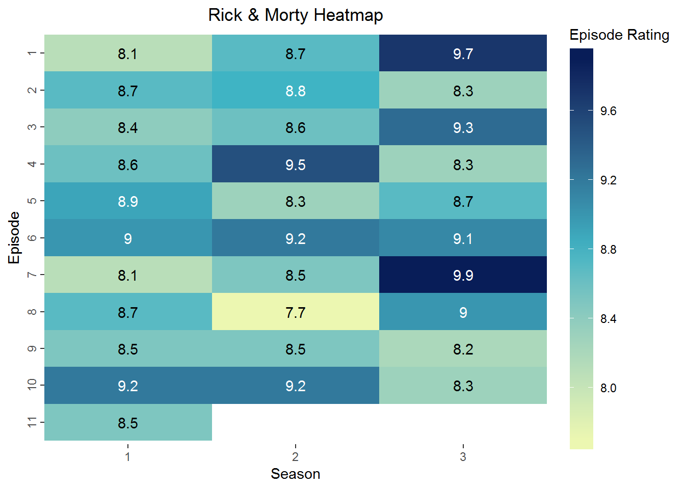
theme里的参数名都是很直白的,legend.key.height用来调整图例的长度,然后用unit函数来指定具体的长度,这里我用了4.1个line的长度,但line究竟代表了什么,我也没搞懂。其实有很多单位的,感兴趣的可以用?unit查看一下。
下面调整图例名的位置,这时仅在theme函数里操作就不行了,还要用到guide_colorbar函数:
ggplot(rm, aes(Season, fct_rev(Episode), fill = Rating)) +
  geom_tile() +
  geom_text(aes(label = Rating),
            color = ifelse(rm$Rating > 8.7, 'white', 'black')) +
  labs(title = "Rick & Morty Heatmap", y = 'Episode', fill = 'Episode Rating') +
  scale_fill_gradient2(low = '#ECF7B1', mid = '#3FB4C4', high = '#081D58',
                       midpoint = 8.8, breaks = seq(10, 8, -.4)) +
  scale_x_discrete(expand = c(0, 0)) +
  theme(plot.title = element_text(hjust = 0.5),
        axis.text.y = element_text(angle = 90, hjust = .5),
        rect = element_blank(),
        legend.key.height = unit(4.1,"line"),
        legend.title = element_text(angle = 90)) +
  guides(fill = guide_colorbar(title.position = 'right', title.hjust = .5))
先使用legend.title参数,将图例名的角度旋转90度,然后在guide_colorbar中将其位置调整到图例条的右侧,并居中。最后就是图例上的刻度线了。虽然在之前更新的最新版ggplot2中,增加了一些针对图例的刻度的调整参数,但仅限于刻度的颜色和宽度,位置方面的调整可能还要等以后的更新,或者我去把ggplot2的内核搞懂(which is impossible)。这里,我暂且先把刻度去掉,于是下面就是最终的代码了:
ggplot(rm, aes(Season, fct_rev(Episode), fill = Rating)) +
  geom_tile() +
  geom_text(aes(label = Rating),
            color = ifelse(rm$Rating > 8.7, 'white', 'black')) +
  labs(title = "Rick & Morty Heatmap", y = 'Episode', fill = 'Episode Rating') +
  scale_fill_gradient2(low = '#ECF7B1', mid = '#3FB4C4', high = '#081D58',
                       midpoint = 8.8, breaks = seq(10, 8, -.4)) +
  scale_x_discrete(expand = c(0, 0)) +
  theme(plot.title = element_text(hjust = 0.5),
        axis.text.y = element_text(angle = 90, hjust = .5),
        rect = element_blank(),
        legend.key.height = unit(4.1,"line"),
        legend.title = element_text(angle = 90)) +
  guides(fill = guide_colorbar(title.position = 'right', title.hjust = .5,
                               ticks = FALSE))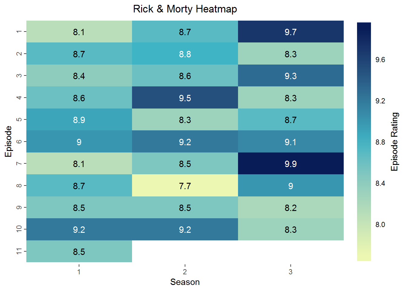
就像小学时的看图写话一样,看图写代码是一种很好的练习方式,以后有时间再找些图练一练吧,这次就先到这了。
sessionInfo()## R version 3.5.1 (2018-07-02)
## Platform: x86_64-w64-mingw32/x64 (64-bit)
## Running under: Windows 7 x64 (build 7601) Service Pack 1
##
## Matrix products: default
##
## locale:
## [1] LC_COLLATE=Chinese (Simplified)_People's Republic of China.936
## [2] LC_CTYPE=Chinese (Simplified)_People's Republic of China.936
## [3] LC_MONETARY=Chinese (Simplified)_People's Republic of China.936
## [4] LC_NUMERIC=C
## [5] LC_TIME=Chinese (Simplified)_People's Republic of China.936
##
## attached base packages:
## [1] stats graphics grDevices utils datasets methods base
##
## other attached packages:
## [1] bindrcpp_0.2.2 forcats_0.3.0 stringr_1.3.1 dplyr_0.7.6
## [5] purrr_0.2.5 readr_1.1.1 tidyr_0.8.1 tibble_1.4.2
## [9] ggplot2_3.0.0 tidyverse_1.2.1
##
## loaded via a namespace (and not attached):
## [1] tidyselect_0.2.5 xfun_0.3 haven_1.1.2 lattice_0.20-35
## [5] colorspace_1.3-2 htmltools_0.3.6 yaml_2.2.0 utf8_1.1.4
## [9] rlang_0.2.2 pillar_1.3.0 glue_1.3.0 withr_2.1.2
## [13] modelr_0.1.2 readxl_1.1.0 bindr_0.1.1 plyr_1.8.4
## [17] munsell_0.5.0 blogdown_0.8 gtable_0.2.0 cellranger_1.1.0
## [21] rvest_0.3.2 evaluate_0.12 labeling_0.3 knitr_1.20
## [25] fansi_0.4.0 broom_0.5.0 Rcpp_0.12.19 scales_1.0.0
## [29] backports_1.1.2 jsonlite_1.5 hms_0.4.2 digest_0.6.18
## [33] stringi_1.1.7 bookdown_0.7 grid_3.5.1 rprojroot_1.3-2
## [37] cli_1.0.1 tools_3.5.1 magrittr_1.5 lazyeval_0.2.1
## [41] crayon_1.3.4 pkgconfig_2.0.2 xml2_1.2.0 lubridate_1.7.4
## [45] assertthat_0.2.0 rmarkdown_1.10 httr_1.3.1 rstudioapi_0.8
## [49] R6_2.3.0 nlme_3.1-137 compiler_3.5.1
